
COMPONENTS
TechCore is built with Next.js and React. Its reusable components help maintain a consistent design across the website. Customize the relevant component, data file or stylesheet to suit your project requirements.
The template uses Bootstrap for responsive layouts and third-party packages for selected interactive features. See the Resources page for package and license information.
Logo Customization
Header logo path: techcore-next-tf/public/assets/img/logo/logo.png and techcore-next-tf/public/assets/img/logo/logo-white.png. These are imported by components/layout/header/Header.jsx and HeaderTwo.jsx. The footer logo is configured through data/FooterOneData.js and data/FooterTwoData.js, which currently import the white logo.
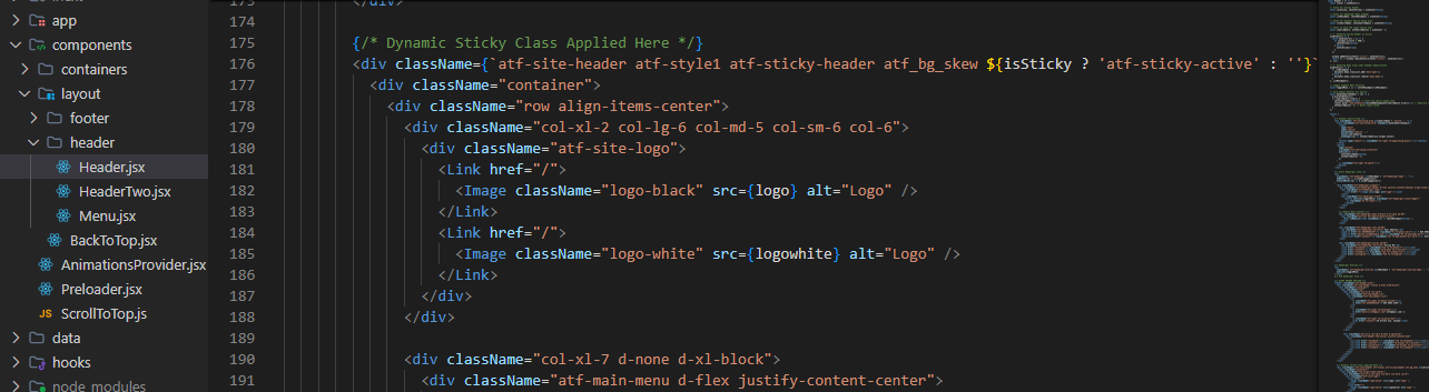
To change the website logo, locate the logo reference used by the header or footer component. Replace the existing image with your own logo and update the image reference when necessary.
-
Logo assets:
Check the logo files inside
public/assets/. -
Header logo:
Locate the header component that renders
the logo and update its image reference. The header components import
public/assets/img/logo/logo.pngandpublic/assets/img/logo/logo-white.png. -
Footer logo:
Check the relevant footer component or
its data file if the logo is configured there. The footer data currently imports
public/assets/img/logo/logo-white.png.
Use the correct asset path and test the logo on desktop and mobile screens.
React Components
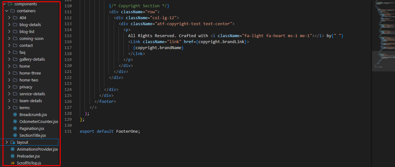
Page sections are built using reusable React components. To customize a heading, description, image, button or section layout, locate the relevant component and update its JSX or data source.
Review component props and existing data structures before changing their behavior. Shared components may be used on multiple pages, so check the affected pages after editing.
Menus and Content Customization
Service cards are configured in techcore-next-tf/data/ServiceDataTwo.js; other sections have their own files in data/. For navigation menus, inspect the relevant header component and any imported data file. Search for the existing visible label if you are unsure where it is defined.
Navigation menus, page headings, descriptions, service information, buttons and other content may be configured through data files or directly inside React components.
- Locate the relevant header, navigation or page component.
- Check its imported data file to identify the menu items or content properties.
- Update the existing labels, links, descriptions or images.
- Preserve the existing data structure and test the updated links.
If you cannot identify the correct file, search the project for the existing menu label or content text.
Copyright Customization
Update the copyright object in techcore-next-tf/data/FooterOneData.js or techcore-next-tf/data/FooterTwoData.js. The footer components read properties such as copyright.brandName and copyright.brandLink. Check both files if both footer layouts are used.
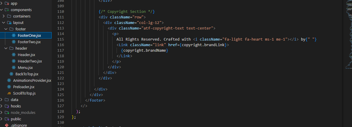
To update the footer copyright text, locate the footer component or its associated data file. Replace the existing text while preserving the current JavaScript syntax and property names.
Check these data files if they are used by your footer implementation:
data/FooterOneData.jsdata/FooterTwoData.js
If the copyright text is written directly inside a footer component, edit that component instead. Verify both footer layouts after making changes.
Colors and Typography
Primary stylesheet: techcore-next-tf/public/css/style.css. Additional responsive and spacing rules are in public/css/responsive.css and public/css/theme-spacing.min.css. Search these files for CSS variables, colour values, selectors and font-family declarations before editing.
Colors
Inspect the project's stylesheets for CSS custom properties, color variables and component selectors. Update the existing color definitions rather than adding conflicting duplicate rules.
Fonts
Locate the font-family declarations and font imports used by the project. Update the relevant stylesheet or font configuration and check headings, body text, buttons and navigation labels.
Responsive Styles
After changing colors, fonts or spacing, test the website at desktop, tablet and mobile screen sizes. Confirm that text remains readable and layouts do not overflow.
Forms and Submission Behavior
Contact, message, coming-soon, FAQ and blog comment forms are provided for frontend layout and interaction demonstration only.
The current demo forms do not provide complete backend submission functionality. Simulated success feedback does not mean that an email has been sent, a subscription has been created or a comment has been saved.
To enable actual submissions, connect each form to an appropriate backend API or third-party service and implement response handling, validation and spam protection.
Mailchimp Setup
If your Mailchimp integration uses
NEXT_PUBLIC_MAILCHIMP_URL,
configure the actual subscription endpoint
in the project's environment configuration:
NEXT_PUBLIC_MAILCHIMP_URL=https://your-mailchimp-subscription-endpointReplace the example value with the actual endpoint expected by your integration. The corresponding form component must also be connected to the endpoint; adding the environment variable alone does not enable submissions.
Slider
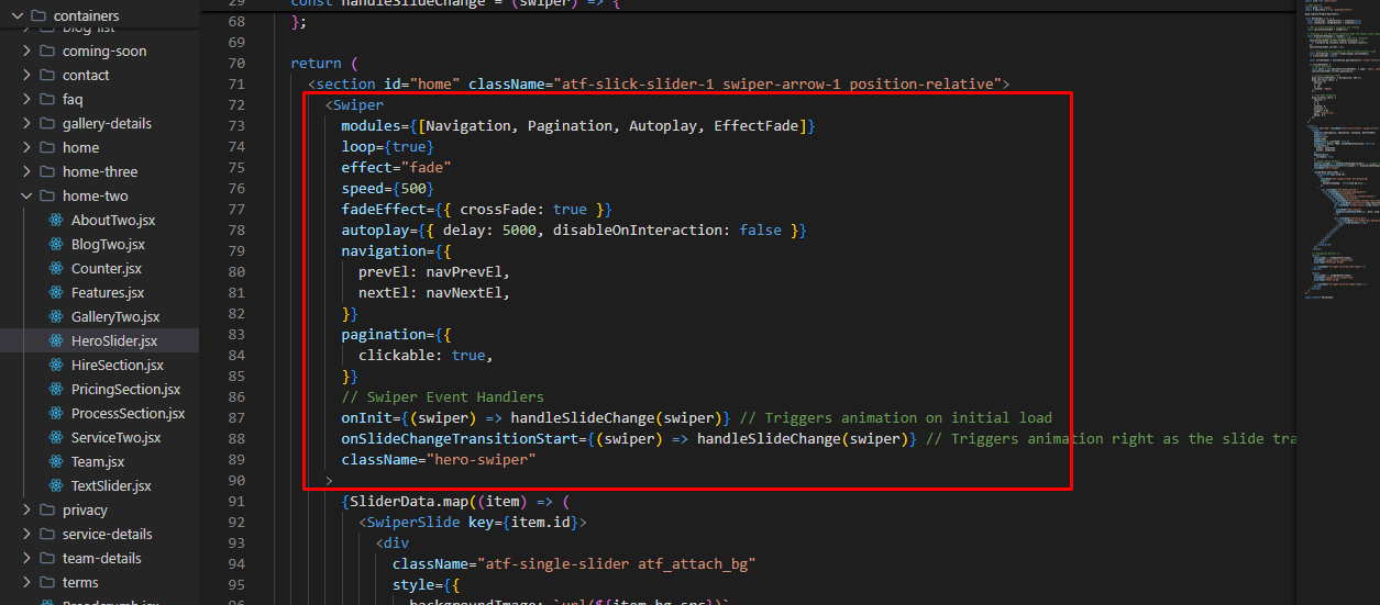
The template uses slider components in selected sections. Locate the relevant component and review its configuration before changing slider behavior.
Common Swiper Configuration Options
| Property | Type | Description |
|---|---|---|
| pagination | boolean | object | Enables pagination or configures pagination settings. |
| loop | boolean | Enables continuous slide looping when supported. |
| speed | number | Sets the transition duration in milliseconds. |
| slidesPerView | number | "auto" | Sets the number of visible slides. |
| slidesPerGroup | number | Sets how many slides advance per transition. |
| autoplay | boolean | object | Enables autoplay or configures its behavior. |
| navigation | boolean | object | Enables previous and next controls. |
| effect | string | Sets the transition effect when supported and configured. |
Available options depend on the installed Swiper version and the modules imported by each slider. See the official Swiper API documentation for details.
External Services
- Google Fonts: Used for web typography where configured. Review font imports to change the font family.
- Google Maps: Map functionality or embedded maps may require a valid configuration and API key, depending on the implementation.
- YouTube: Embedded videos require an internet connection and are subject to YouTube's availability and terms.
- Mailchimp: Newsletter integration requires a valid subscription endpoint and component configuration.
External services may have their own terms, privacy policies, usage limits or fees. Configure each service according to its official documentation.